[PT]
Um amigo meu entrou em contato comigo me contando sobre a necessidade que havia de fazer o redesign de sua marca: uma instituição educacional que oferecia cursos preparatórios para candidatos que prestariam concursos públicos, e além disso, a própria instituição buscava dar saltos maiores no ramo de atuação. Era necessário traduzir visualmente a evolução pela qual não só a instituição passou mas também seu corpo docente, seu corpo administrativo, tornando assim a marca "mais profissional". O corpo docente era formado não só pelo fundador, mas também seu sócio, outros amigos que se graduaram na mesma faculdade.
[EN]
A friend of mine contacted me telling about the need of redesigning his brand: an educational insititution which offered preparatory courses for candidates who were about to take civil service examinations, and beyond that, the institution itself was looking to take bigger leaps in the area of action. It was necessary to visualy translate the evolution that not only the institution went through but also its teaching staff, its administrative staff, making the brand "more professional". The teaching staff was composed not only by the founder of the institution but also his managing partner, and other friends who graduated in the same college.
[PT]
Dentro do briefing também, havia a questão da adição da tagline "Educação" abaixo do nome, com o intuito de mostrar a evolução pela qual a instituição havia passado, não só numa questão de tempo de existência, mas do próprio amadurecimento do corpo docente e da administração. A partir desse insight, a identidade visual precisava mudar.
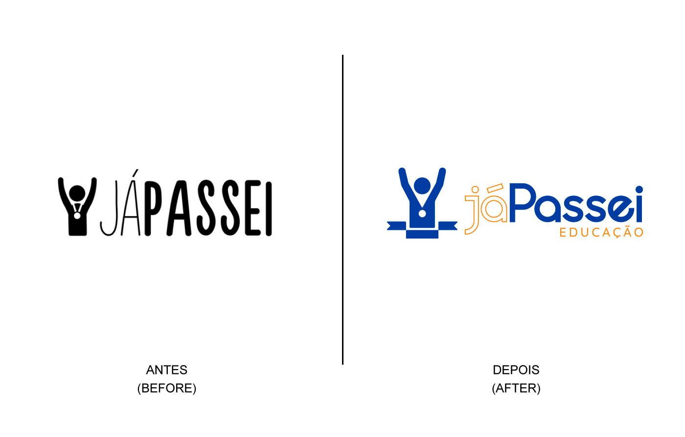
A marca anterior demonstrava uma simplicidade orgânica e tinha como cor principal o azul claro. Traduzia o sentimento de uma instituição que dava seus primeiros passos em sua área de atuação.
A ideia principal foi manter o destaque no símbolo, o mascote vencedor e a ênfase na palavra "passei", que é a mais dita por "concurseiros" de todos os lugares. É o desejo principal daqueles que prestam não só um concurso público, mas qualquer vestibular ou qualquer tipo de prova eliminatória.
O símbolo do mascote vencedor passou por mudanças, deixou de ser tão orgânico e passou a ser um pouco mais geometrizado, mais ângulos retos. Além disso, a medalha em seu peito foi minimalizada por questões de redução. A ideia do mascote em si veio da paixão do fundador e seu sócio por esportes em geral e tudo o que permeia a prática de algum esporte: concentração, força, foco, determinação, energia e etc. Logo me veio à mente o design da iconografia das Olimpíadas de Munique, marcante. Acabei me baseando nessa referência, de certa forma, para o redesign do mascote vencedor. A tipografia passou a ser mais geométrica também, mais circular.
[EN]
Within the briefing, there was also an issue: the adition of the tagline "Educação" - meaning "education" - under the name, with the intention of showing the evolution that the institution had been through, not only in a matter of time of existence, but the development and maturing of the teaching staff and the administration itself. From this insight, the visual identity needed to change.
The previous brand showed an organic simplicity and had a light blue as its main color. It translated the feeling of an institution giving the first steps in its acting area.
The main idea was keeping the highlighted symbol, the winner mascot and the enphasis on the word "passei" - meaning "I passed" - which is the most said word by those who take civil services exanimations. It's the main desire for those who take any kind of eliminatory exam.
The symbol of the mascot went through some changes, not such as organic as it used to be and more geometric, more right angles. Beyond that, the medal in his chest was minimalized for reduction issues. The idea of the mascot itself came from the passion of the founder and his managing partner for sports in general and all that revolves around the praticing of any sport: concentration, strenght, focus, determination, energy and etc. As soon as they told me that, what came to my mind was the iconography design of the Munich Olympics, remarkable. I took this as a reference for the mascot's redesign. The tipography also changed, being more geometrical, more circular.
[PT]
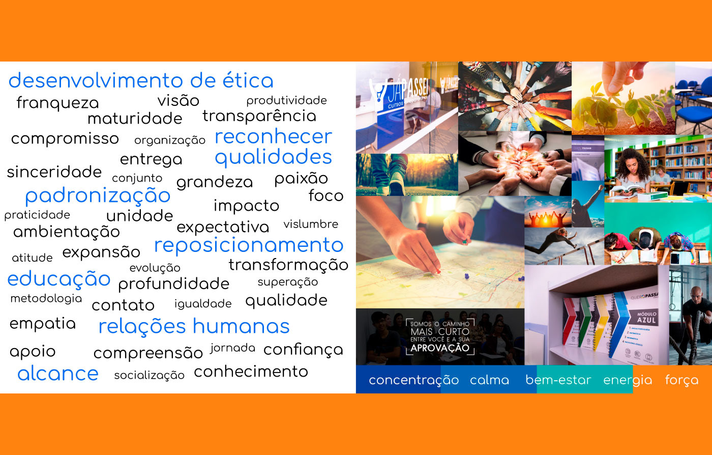
Painel Semântico.
[EN]
Moodboard. Bringing all the concept behind the Já Passei, keywords like "ethics development", "human relationships", "range", "repositioning", "qualities acknowledgement" and etc. Along with the colors chosen to the project, concentration, calmness, well-being, energy and force.

[PT]
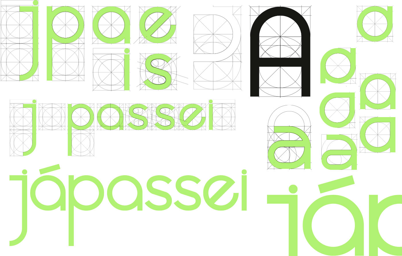
Construção da tipografia presente no redesign de marca.
[EN]
Construction of the typography present in brand redesign.
[PT]
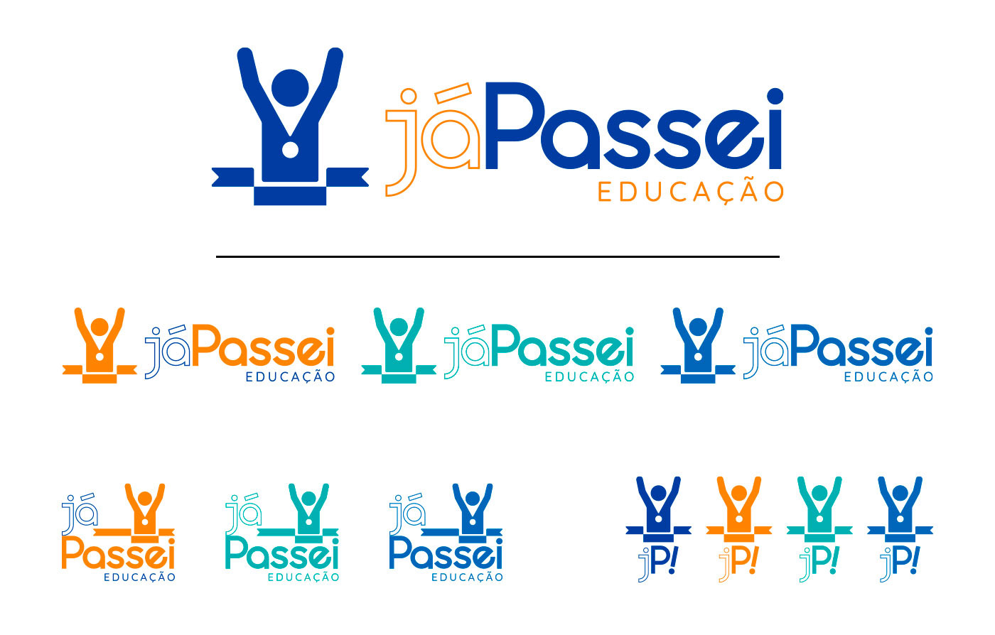
O logotipo e suas variantes. Assinaturas horizontais, verticais e reduzidas.
[EN]
The logotype and its variants. Horizontal signatures, vertical and reduced signatures.

[PT]
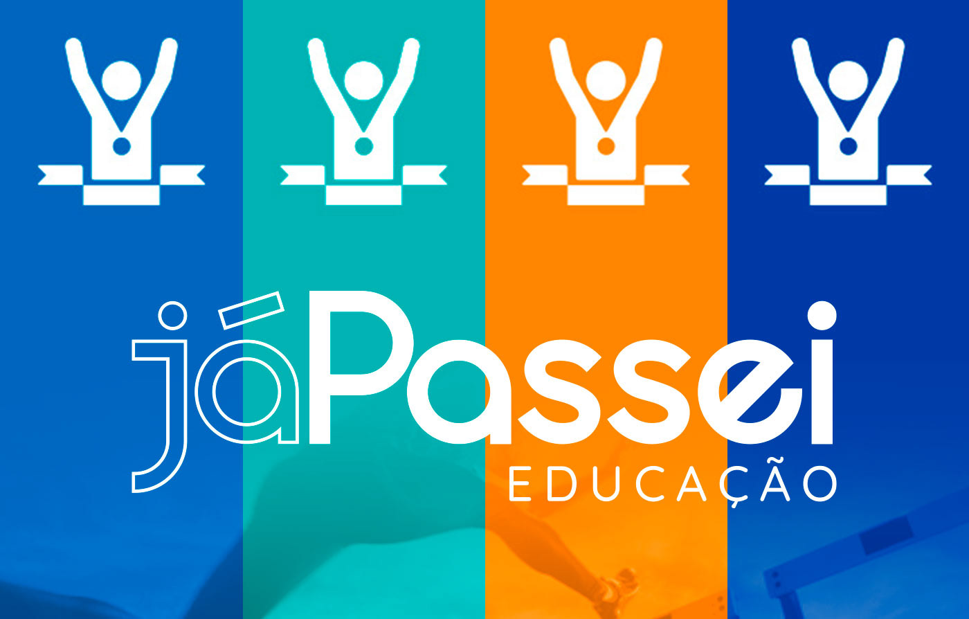
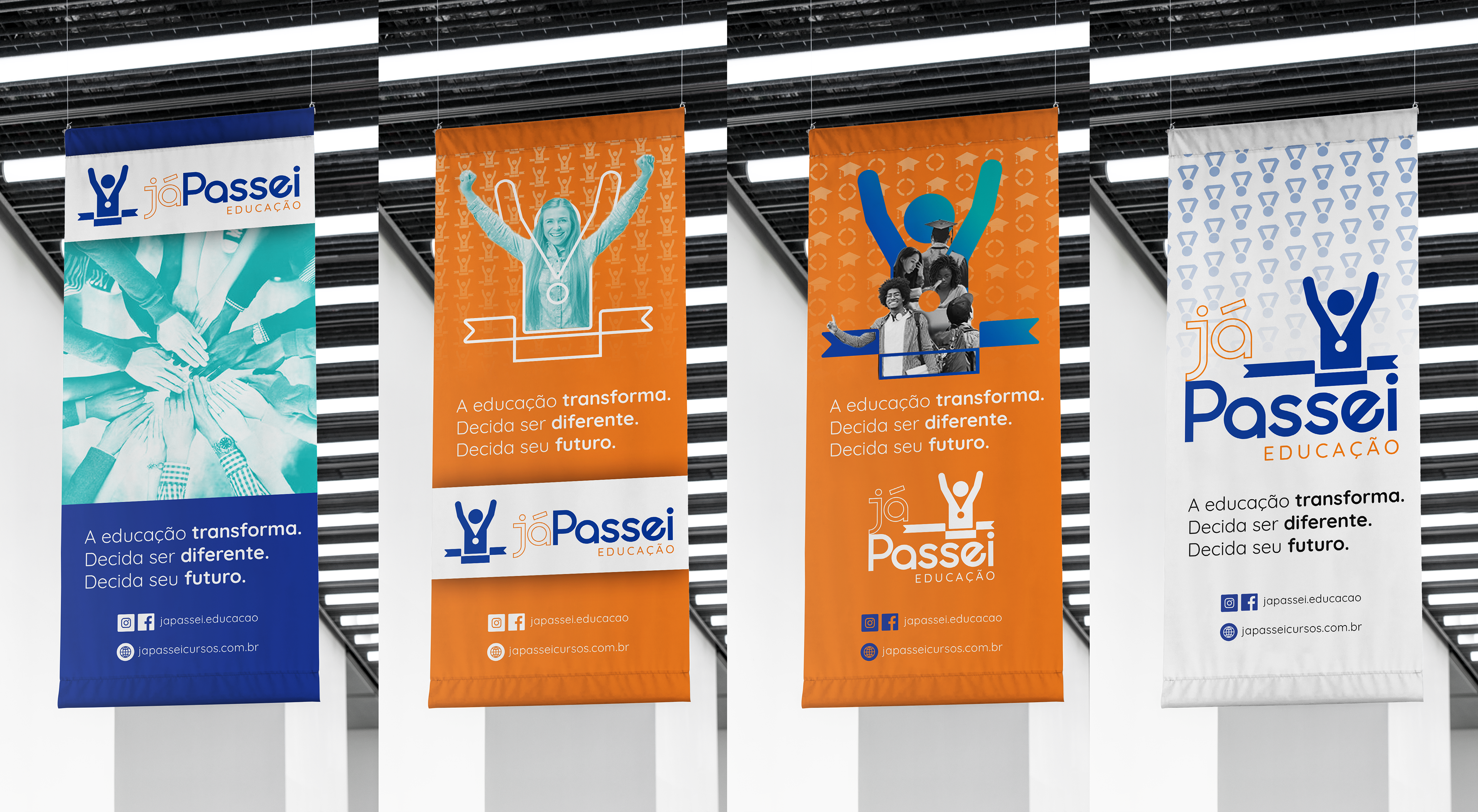
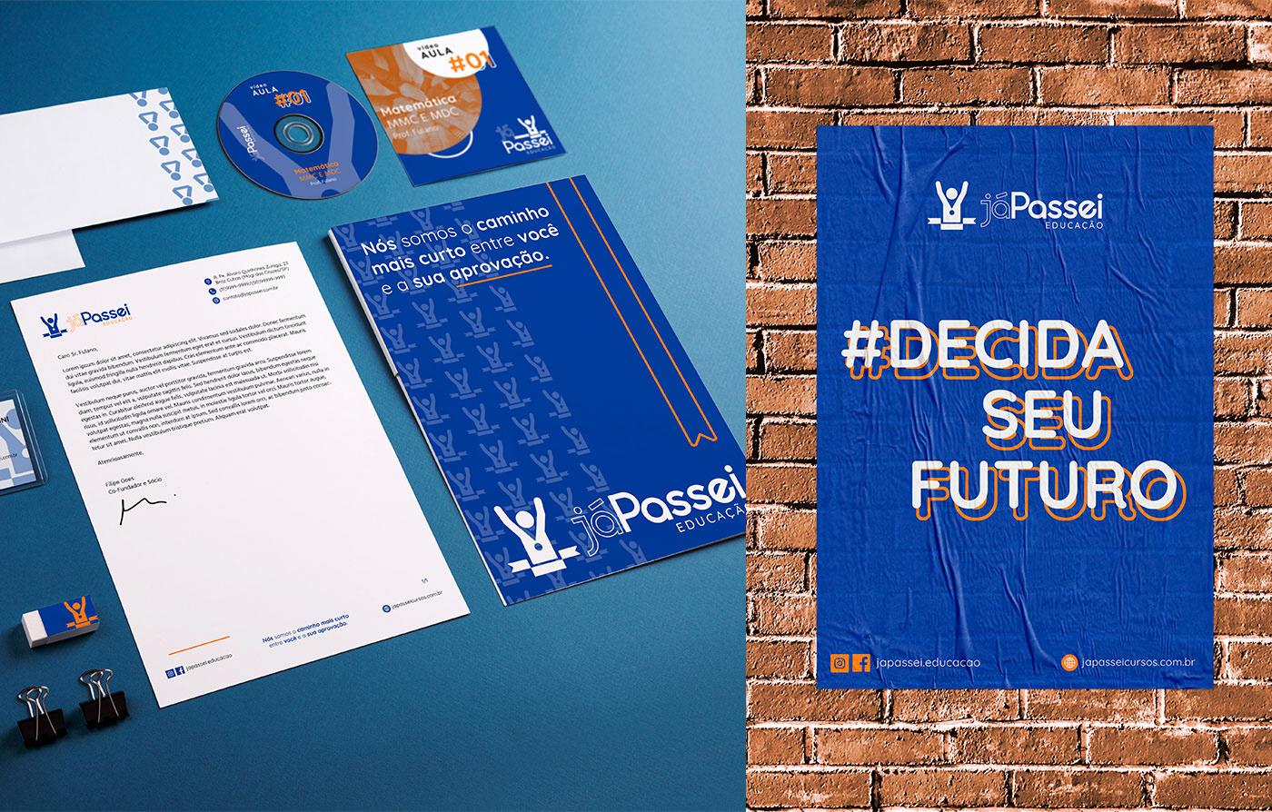
Há uma grande diferença numa marca quando a identidade visual é pensada como um todo, onde os elementos trabalham juntos para criar uma composição visual embasada. O intuito do redesign de identidade visual do Já Passei era justamente unificar os conceitos por trás da marca em si e das qualidades adquiridas com o passar do tempo. Traduzir isso através das cores também foi muito importante, já que não havia uma paleta determinada.
[EN]
There is a big difference in a brand when the visual identity is tought as a whole, where the elements work toegether, creating a based visual composition. The main goal of the Já Passei's visual identity redesign was to unify the concepts behind the brand and the acquired qualities as time went by. To translate it through colors was also really important, knowing that there was no determined color palette.