[PT]
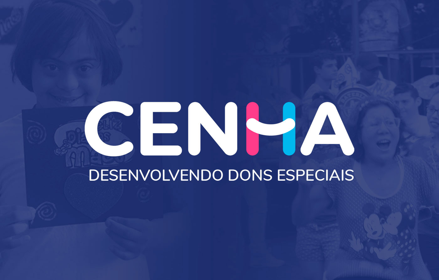
Esse foi um projeto feito por mim, como trabalho de conclusão do meu curso de Design, na faculdade. Trata-se do redesign de identidade visual de uma ONG (organização não-governamental) híbrida, ou seja, atende tanto demandas públicas quanto comerciais.
O CENHA (Centro Nossa Senhora da Penha) fica localizado na zona leste da cidade de São Paulo e presta serviços de apoio e acompanhamento socioeducativo a crianças que possuem algum tipo deficiência, seja ela de caráter mental ou físico. Os pais também são muito incluídos nesse processo, justamente para que haja um acompanhamento completo e também um trabalho colaborativo entre funcionários (alguns deles volutnários) e os próprios pais ou responsáveis.
Com uma ótima infraestrutura, o CENHA acaba se tornando uma referência local em apoio a crianças com deficiência. Era necessária uma identidade visual mais moderna, que seria mais coerente com a instituição.
Trata-se de um estudo de caso, onde o CENHA ocupou posição de instituição parceira no âmbito do meu projeto.
[EN]
This project was made by me, as a final paper, before I got my bachelor's degree in Design. It's the redesign of the visual identity of a hybrid NGO (non-governmental organization) which means it deals with both public and private demandings.
CENHA (Centro Nossa Senhora da Penha) is located in the east side of the city of São Paulo and offers socio-educational services of support and accompany to children who have some kind of deficienfy, mental or physical. Their parents are also included in this proccess, so there's a colaborative work between emplyees (some of them volunteers) and the parents or responsible parts.
The NGO has a great infrastructure, CENHA becomes a local reference in support to childern with deficiency. A modern visual identity was necessary, to be more coherent with the institution.
Actually, this is a study case, where CENHA was a partner institution inside the scope of my project
[PT]
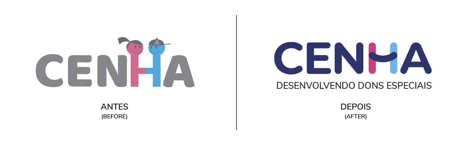
A ideia principal foi criar o redesign sem abrir mão de elementos da identidade visual atual. Trata-se da letra "H" estilizado.
No logotipo atual, fizeram dessa letra uma analogia visual de união e também representação do principal "público-alvo" da instituição: crianças. Meninos e meninas.
O logotipo atual traz o cinza como cor predominante, tanto nas letras quanto nos detalhes.
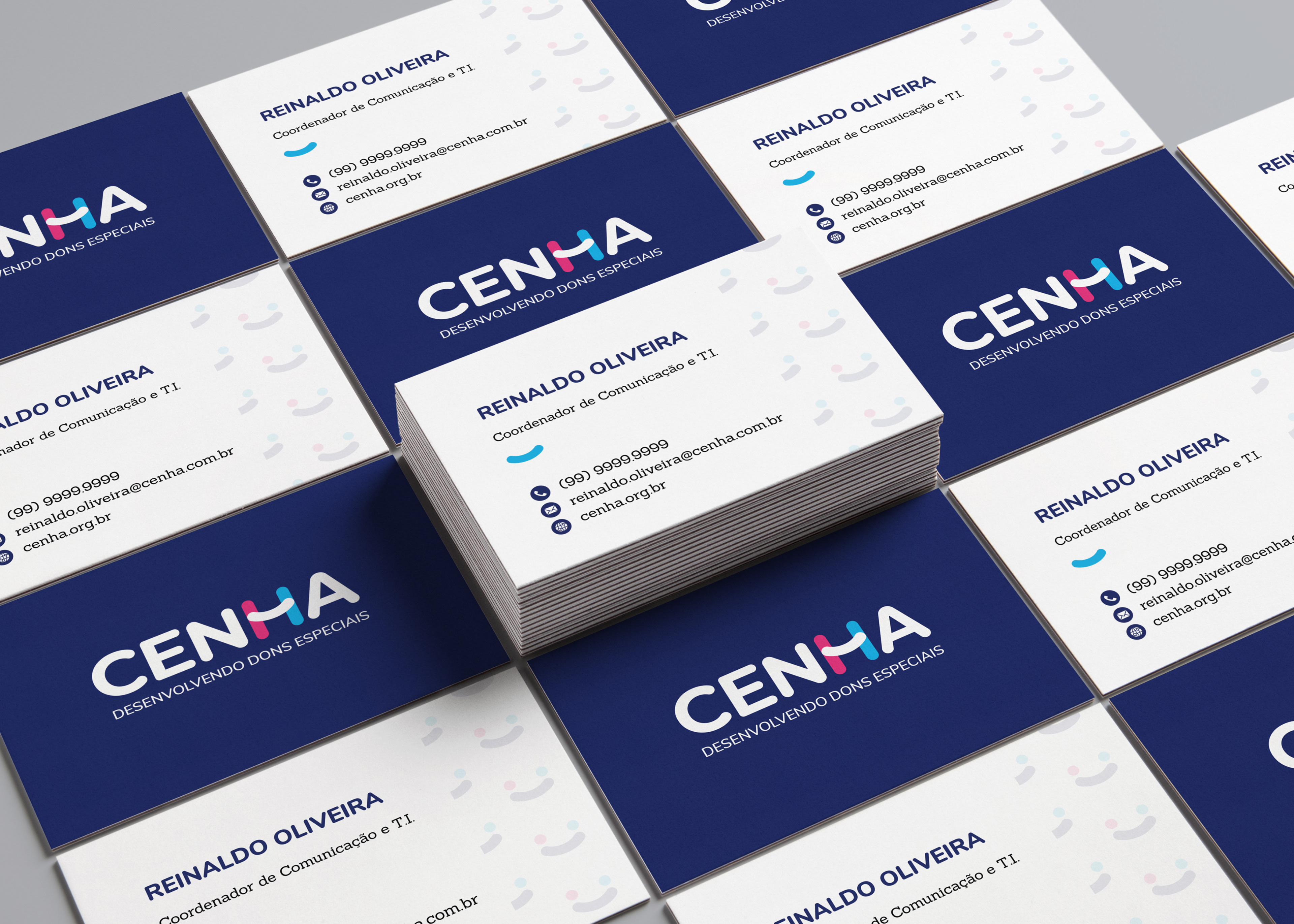
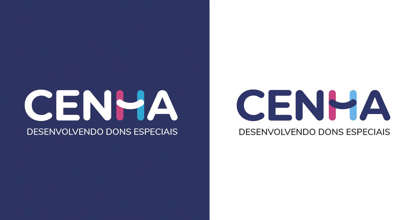
A proposta de redesign trouxe uma tipografia mais leve, com suas curvas mais bem construídas, com a intenção de ser mais amigável por si só, sem a necessidade de um item tão chamativo quanto a letra "H" com carinhas felizes, que aliás foi substituído por algo muito mais sutil. A haste central da letra "H", por si só, já tem como intenção aludir um sorriso - que estava presente no logotipo atual, porém de forma muito detalhada -, enquanto as outras hastes carregam as cores que já eram presentes no logotipo atual.
[EN]
The main idea was to create the redesign without giving up some current visual identity elements. It's about the stylized "H".
In the current logotype, they made of this letter a visual analogy of union e also a representation of the main institution's target audience: kids. Boys and girls. Gray is the predominant color in the current logotype, in the letters and on the details. The redesign proposal brought a lighter typography, with better determined curves, with the intention of being more friendly by itself, without the need of a flashy item as the letter "H" with happy faces inside of it, which was replaced by something more subtle. The "H"'s central stem has the intention to allude a smile - which was present in the current logotype, but in a very detailed way -, while the others stems bring the colors that were already present in the current logo.
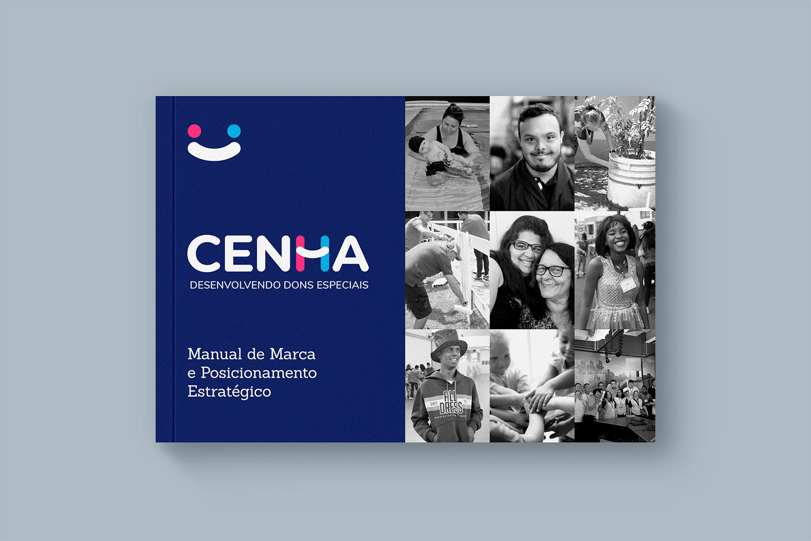
[EN] Strategic Positioning and Brand Manual
[PT]
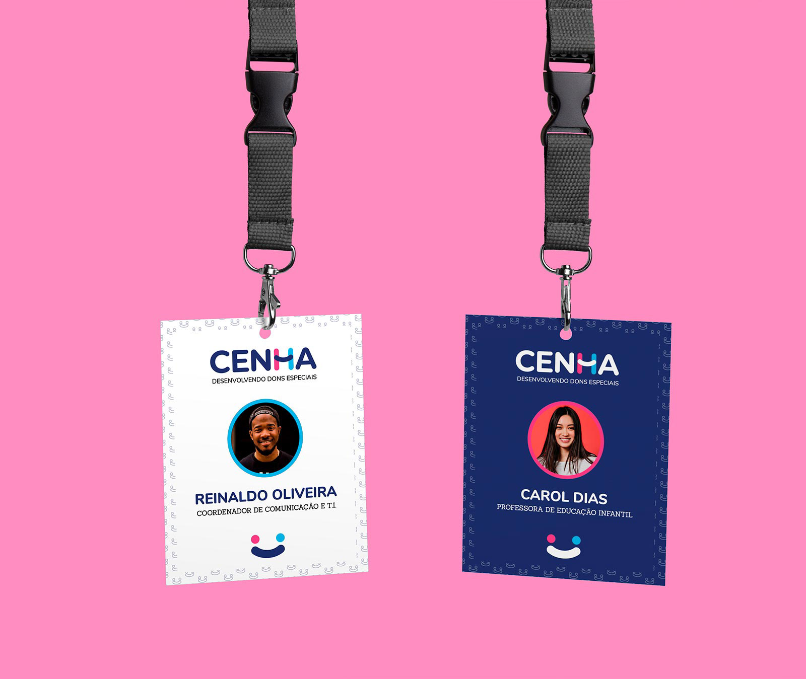
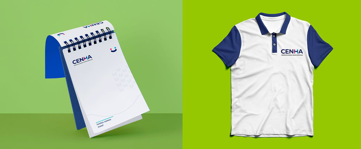
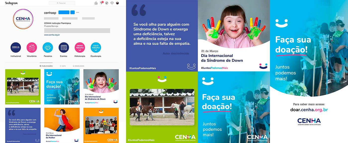
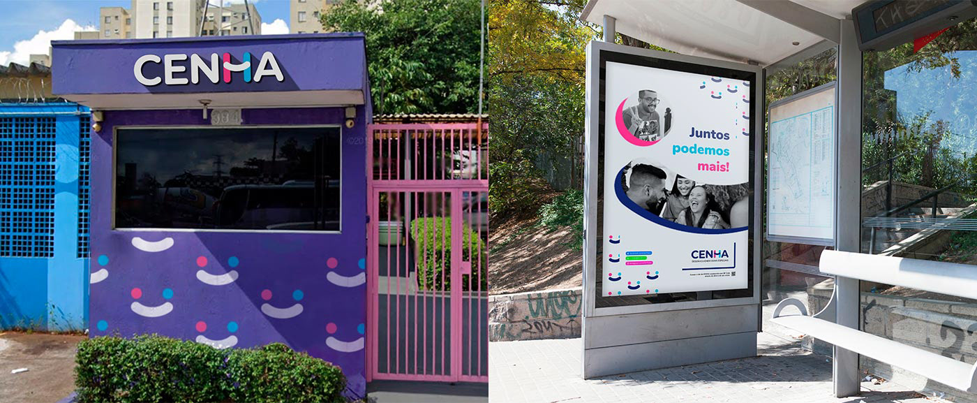
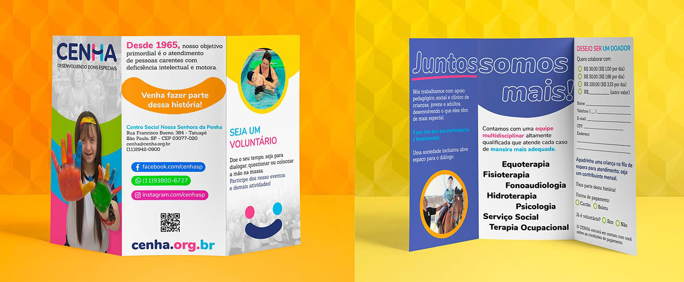
A ideia principal, acima de tudo, foi trazer uma personalidade mais amigável para a identidade visual da marca, com cores mais vivas, que trazem o otimismo do voluntariado que está junto com o CENHA, assim como o vislumbre um mundo melhor e mais inclusivo que a instituição tem em seu cerne.
[EN]
The main idea, above everything, was to bring a more friendly personality to the visual identity of the brand, with more vivid colors, which shows the optimism of the volunteers and the employees of the institution, just like the institution's vision of a better and more inclusive world, present in its core.